About
A new platform for the 8 million taxpayers of Buenos Aires.
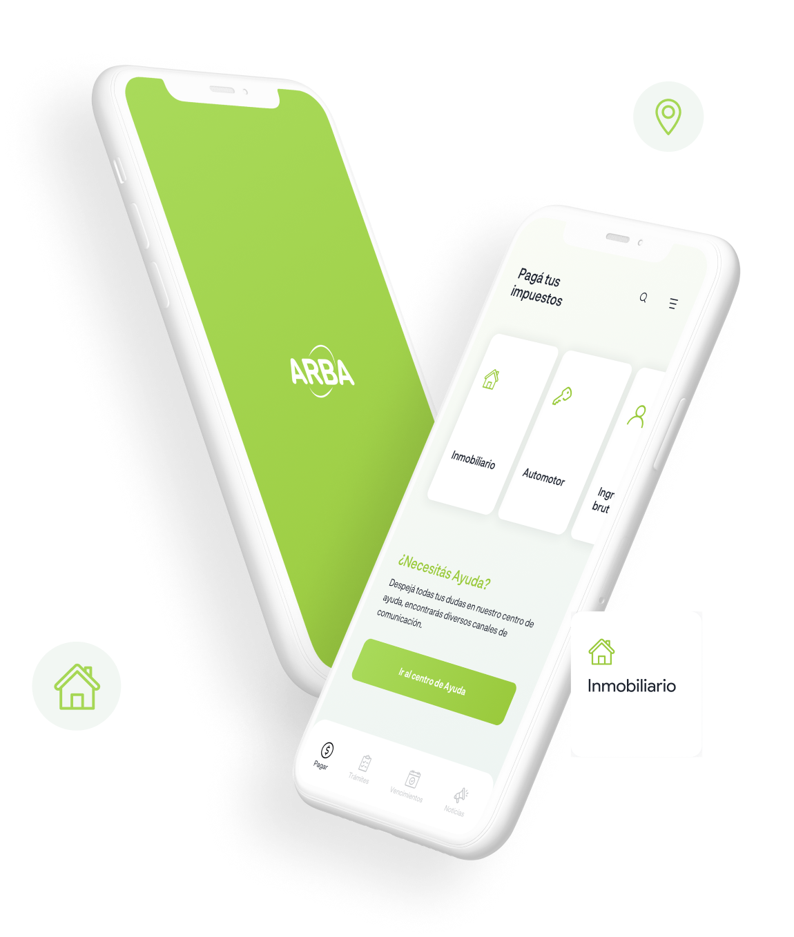
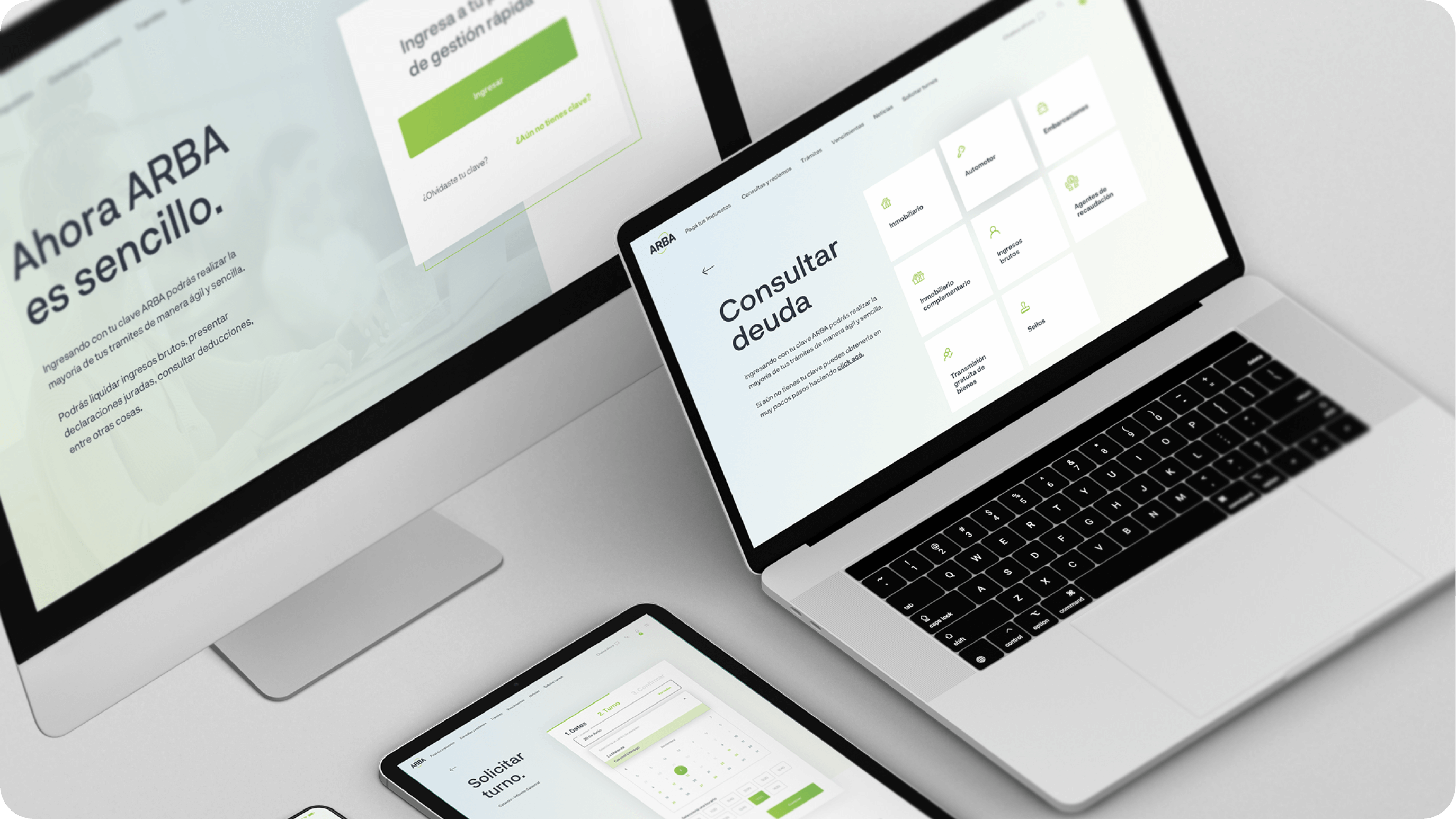
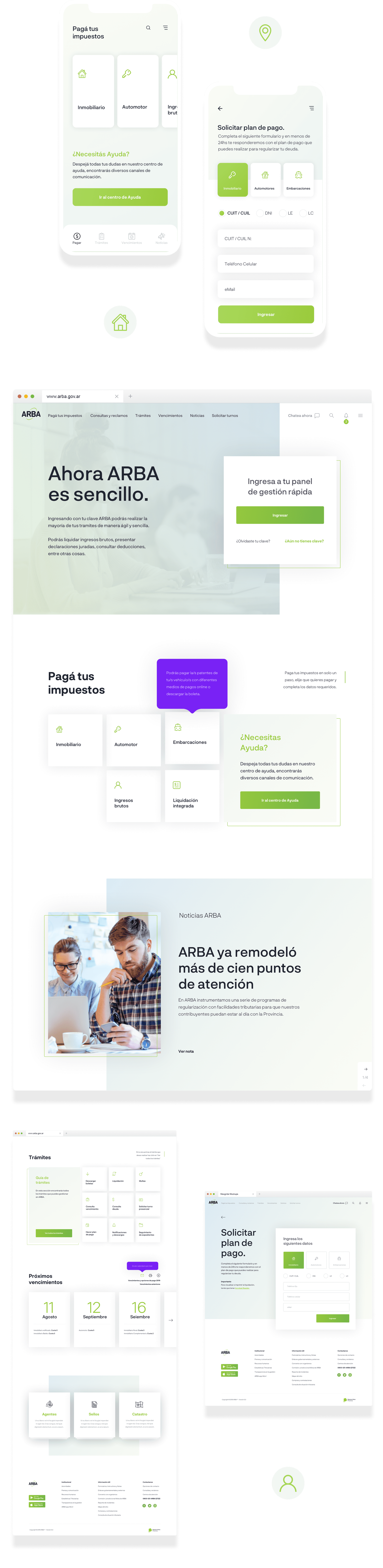
ARBA teamed up with our UX design specialists to transform its digital experience. This involved redesigning the ARBA’s primary digital touch points, including its public websites and mobile app.
Simplifying the tax payment experience for citizens was not an easy task, but we accepted the challenge and the result was more than positive.
Client
ARBA
Buenos Aires, Argentina
Industries
fintech
Practices
- Design Strategy
- UX/UI
- Development
- Design Thinking
- CX, UX & Interaction Design
- Design Systems
- User Research & Testing
- Visual Identity
- UI Design
- Frontend & Backend
- Mobile App Development
ux design
discovery & wireframing
The work took all aspects of the UX design process, including user research, information architecture, interaction design, ideation, rapid prototyping, usability testing, visual design, front-end development and training.
We work closely with ARBA to ensure a comprehensive understanding of user needs, business improvement opportunities, and the most important aspects to consider when redesigning the site.
style guide
color & typography
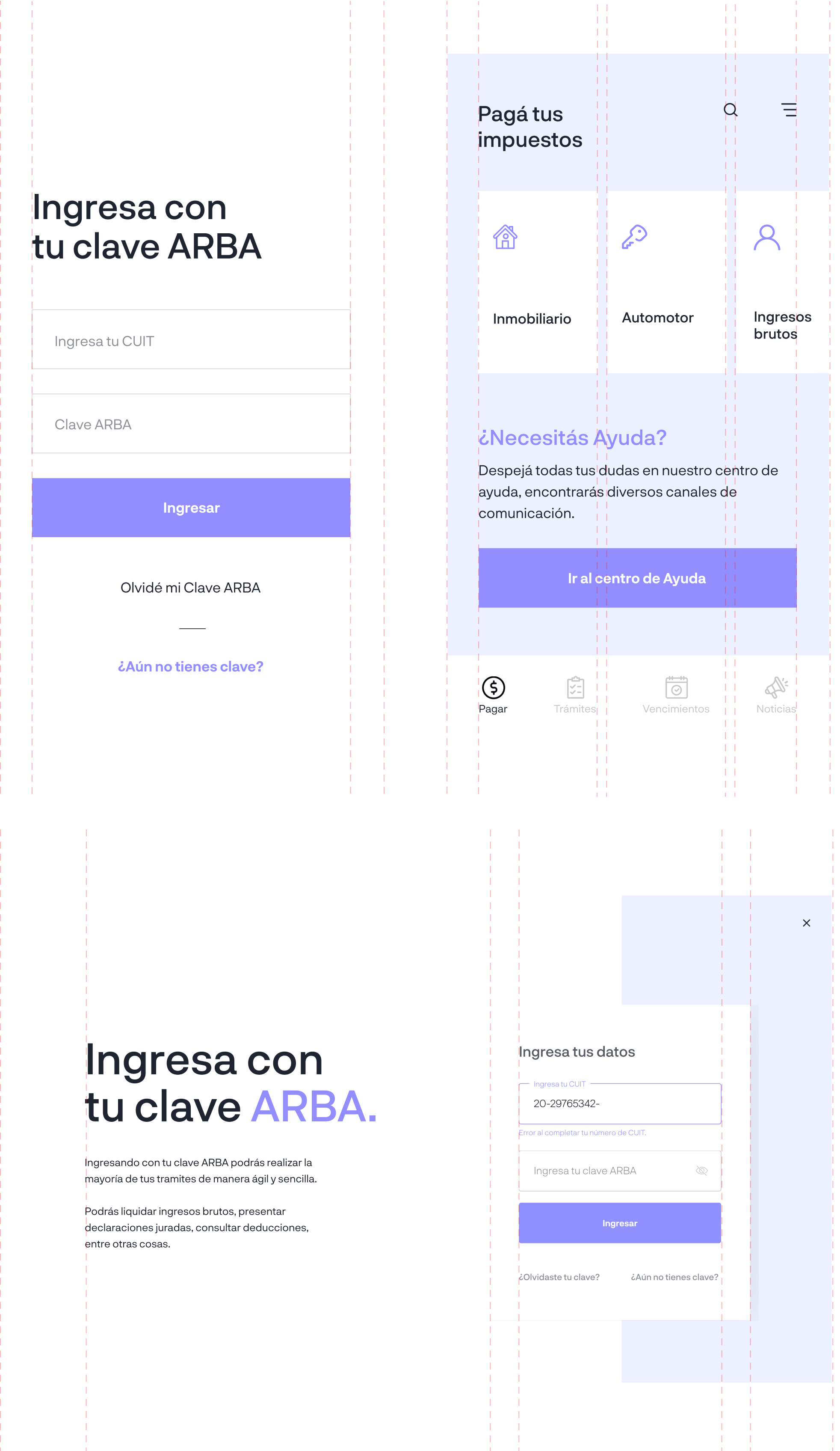
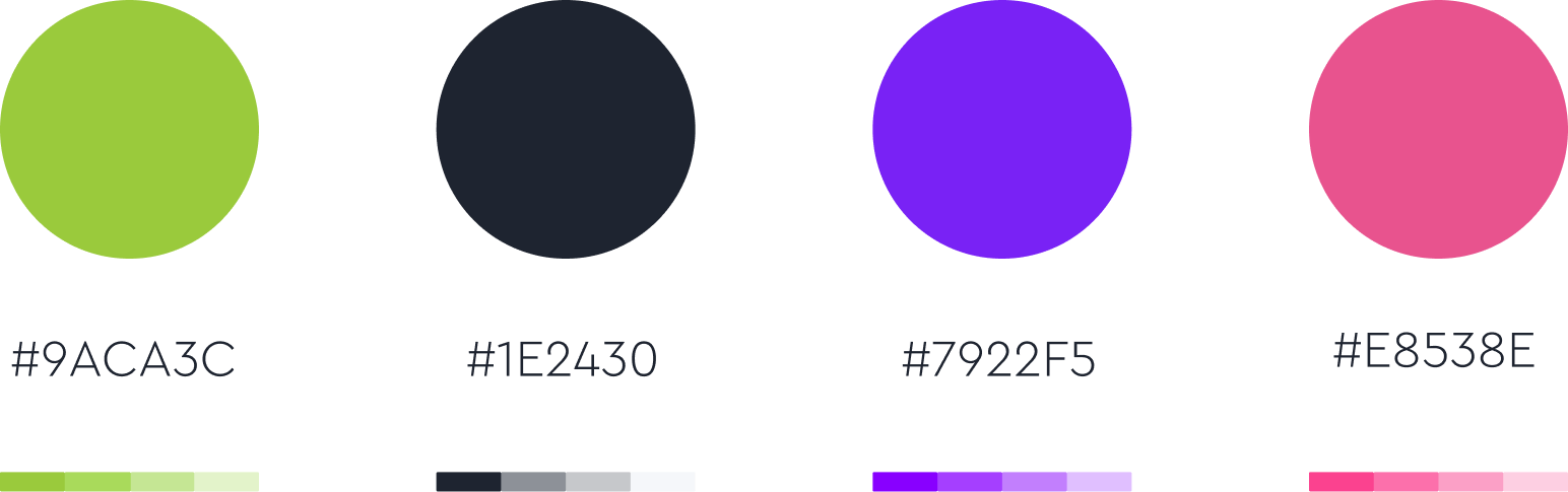
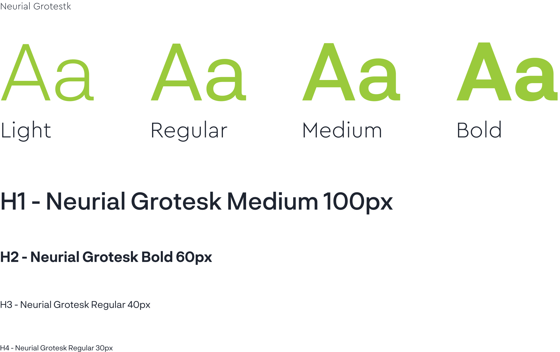
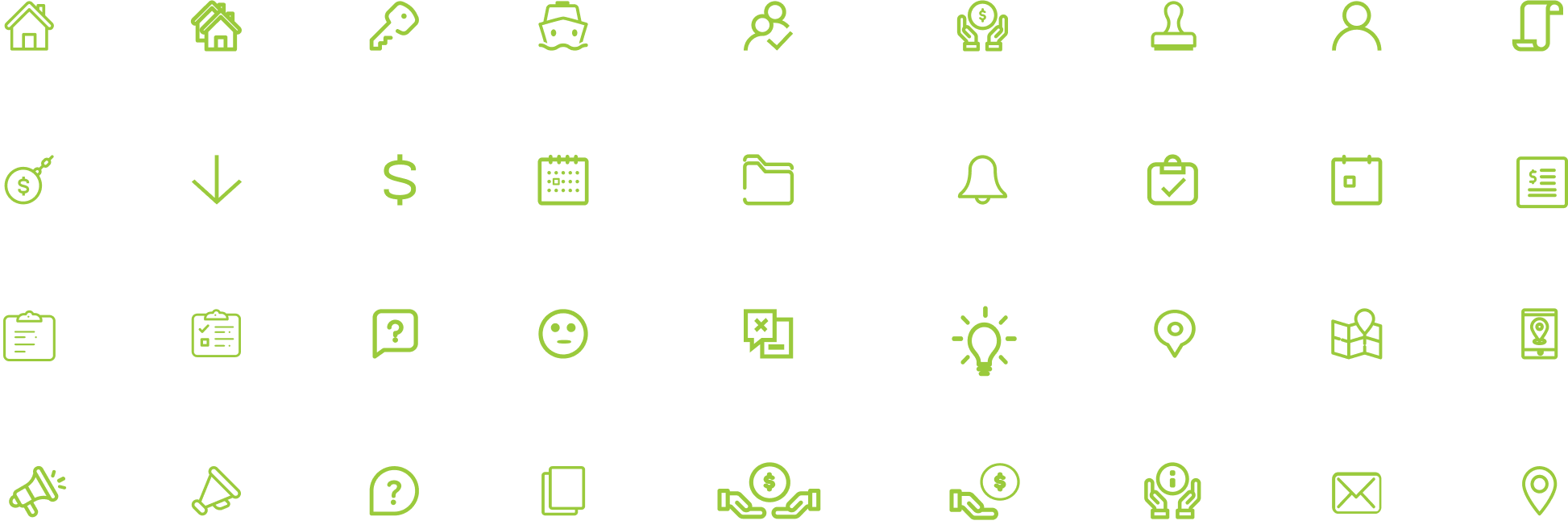
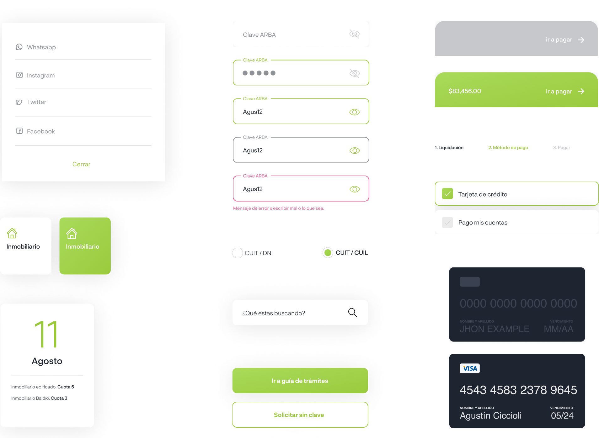
We transformed ARBA’s large and dissimilar color palette into one that is focused and effective. This lead us to the creation of a detailed style guide, defining a design system of the user interface components for a unified visual language across the entire application.
The style chosen for the visual design was minimalist and clean. The fonts and the contrast guarantee a great readability without losing their appeal. We created an all-new experience on mobile that provided potential customers with a simplified user journey and path to pay taxes.
colours
typography
icons
elements
visual design
easy and accessible to everyone
Changing the way people can pay their taxes was an extremely important task, which is why we understood that we had to transfer that concept to a design that were simple and modern at the same time, but usable and accessible to all people.
We aimed for a "less is more" mentality for this project, knowing that information overload throughout the site could affect the overall user experience.
let’s work together